VIVOTEK Software Series Logo Proposal
Home > VIVOTEK Software Series Logo Proposal
Overview | Design process
Overview
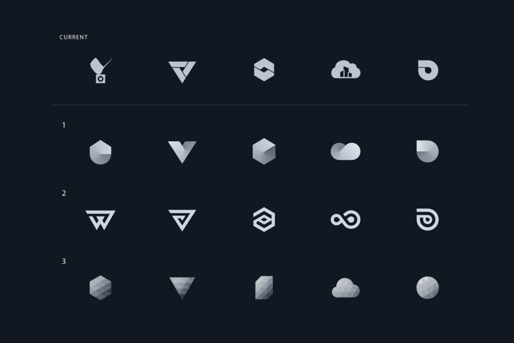
The rebranding proposal of VIVOTEK’s software series logo is to revamp the brand’s image among customers. I came up with 3 different concepts, each with its individual directions, in hopes to build a unique and consistent image of the brand.
1. Origami: Chiseled shapes and subtle lighting with shadow to portray an origami-like texture
2. One line: The simple one-line drawing emphasizes the clear image of the brand, showing neatness and professionalism
3. Krystal: Decorating logos with a gradient-colored mosaic of duplicated shapes to represent the smoothness of the devices
? The Design Goal
1. Ensure redesigned logo retains original renditions and characters
2. Focus on meaningful color usage
3. Create a consistent visual identity
? My Role
It is a solo project, I am in charge of logo design.
?️ Project Info
Project Duration: 3 Weeks (2020)
Categories: Visual Design, Logo, Tech Industry
Overview | Design process
Design process
I came up with 3 different logo concepts by following the processes below upon understanding the current logo:
1. Logo drafts: Logo creation based on strategy (hand-drawn and digital)
2. Logo design: Refine respective logos to fit different scenes
3. Mockup: Acutely showcase the concepts of logos


